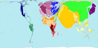
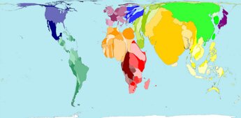
Tyler Cowen posts links to a series of manipulated maps. Included is a surprise - India and China are getting thinner.:
Here is a population-weighted map of the world, circa 1500:

Here is the projected world population map, circa 2050:

Here are other neat maps. Here are maps of tourism, emigration, and refugees; Here is my favorite, a map of the flow of net immigration. Or try this map of aircraft departures, watch Africa disappear. Here is the strange geography of fruit exports. Here is how to make South America look really big, or reallly small (can you guess?).
Technorati Tags: asia, east asia, maps, northeast asia, south asia, southeast asia


April 2nd, 2006 at 11:50 am
aaaaaaaaaaaaawesome